Steve Sachs
Bill 2.png

Bill & Melinda Gates Foundation Discovery Center

The museum asked for a guestbook. We designed an emotional experience that connects real people.


SKILLS USED

UX Strategy, User Research, Ideation, Wireframing, Interaction Design, Prototyping, and User Testing

MY ROLE

I lead the effort to understand museum visitors, conducted usability tests, and designed the second iteration of the prototype.

 
GATES%25252BINSIDE.jpg
 

Here are three ways I made an impact within a large team.

UNDERSTANDING THE USERS

I lead the effort to understand museum visitors. I conducted interviews with 10 visitors in order to understand their needs. I then synthesized the information and created a persona that provided the team with a detailed picture of who we were designing for.

CONDUCTING USABILITY TESTS

Using a paper prototype, I conducted usability tests with 6 visitors. The tests revealed major pain points early, saving the team from wasting time and energy perfecting a digital prototype of a flawed design.

DESIGNING THE SECOND PROTOTYPE

Relying on findings from the usability tests, I designed the second iteration of the prototype from the ground up. I simplified several interactions and eliminated visual clutter from the original design. My design became the backbone of the final design that the team presented to the client.


100q0x000000lhk1d7D25.jpg
 

The Client

The Gates Discovery Center is a free interactive museum that highlights the work of the Bill & Melinda Gates Foundation.

The foundation employs people stationed around the world, referred to as Changemakers. Exhibitions at the Discovery Center show how Changemakers solve difficult problems related to poverty, health, and education.


image.jpg
 

The Challenge

The Discovery Center asked us to redesign their guestbook.

The museum’s request was simple: design a new guestbook that captures visitor comments and feedback, and collects visitor emails.


image.jpg
 

Solving the Right Problem

What problem would a new guestbook solve?

Our team interviewed a museum representative in order to better understand why the Discovery Center felt they needed a new guestbook. We wanted to know about the problems with their existing guestbook and why they planned to collect comments and emails.

OUR INSIGHTS

The existing guestbook at the Discovery Center.

1. The current system was analog, and it had broken down.

The museum liked its pen-and-paper guestbook because they felt handwritten messages were consistent with their brand. But when the guestbook became full, it was up to the Discovery Center staff to scan the pages into a computer. Staff didn’t have time to scan the pages, so they usually ended up in the trash.

2. The Discovery Center wanted more visitors to sign up for their newsletter. 

The Discovery Center was collecting emails because they wanted to increase newsletter sign ups. Visitors who left their email in the guestbook would be signed up for the Gates Foundation newsletter.

3. Guestbook comments would be read by Changemakers around the world.

Visitors didn’t know it, but Discovery Center staff sometimes emailed heartfelt comments to Changemakers as a way to boost morale in the field.


image.jpg
 

Understanding User Needs

Thanks to the insights gained from our interview, I had a decent amount of information about the Discovery Center and the Changemakers. I decided to map out the needs of each group in order to figure out how their needs were related.


Discovery Center

GOALS

Motivate and inspire Changemakers

Increase newsletter signups

Leverage the feeling of inspiration felt by visitors

Create a database of visitor comments and feedback

PROBLEMS

Guestbook pages are not being scanned by staff

No way to catalogue handwritten comments/feedback

No way to differentiate between comments and feedback

No follow-up with visitors after comments and feedback are submitted

BEHAVIORS

Believe handwritten comments have a personal touch

Believe handwritten comments are consistent with their brand


Changemakers

GOALS

Stay motivated and inspired in the face of difficult problems

Understand the impact of their work on visitors to the Discovery Center

PROBLEMS

Currently rely on Discovey Center staff to relay comments

Have no way to access comments when they want or need to see them

Can only understand comments written in languages they can read

BEHAVIORS

Not enough information to know


image.jpg
 

The Missing Piece

I still needed to understand museum visitors.

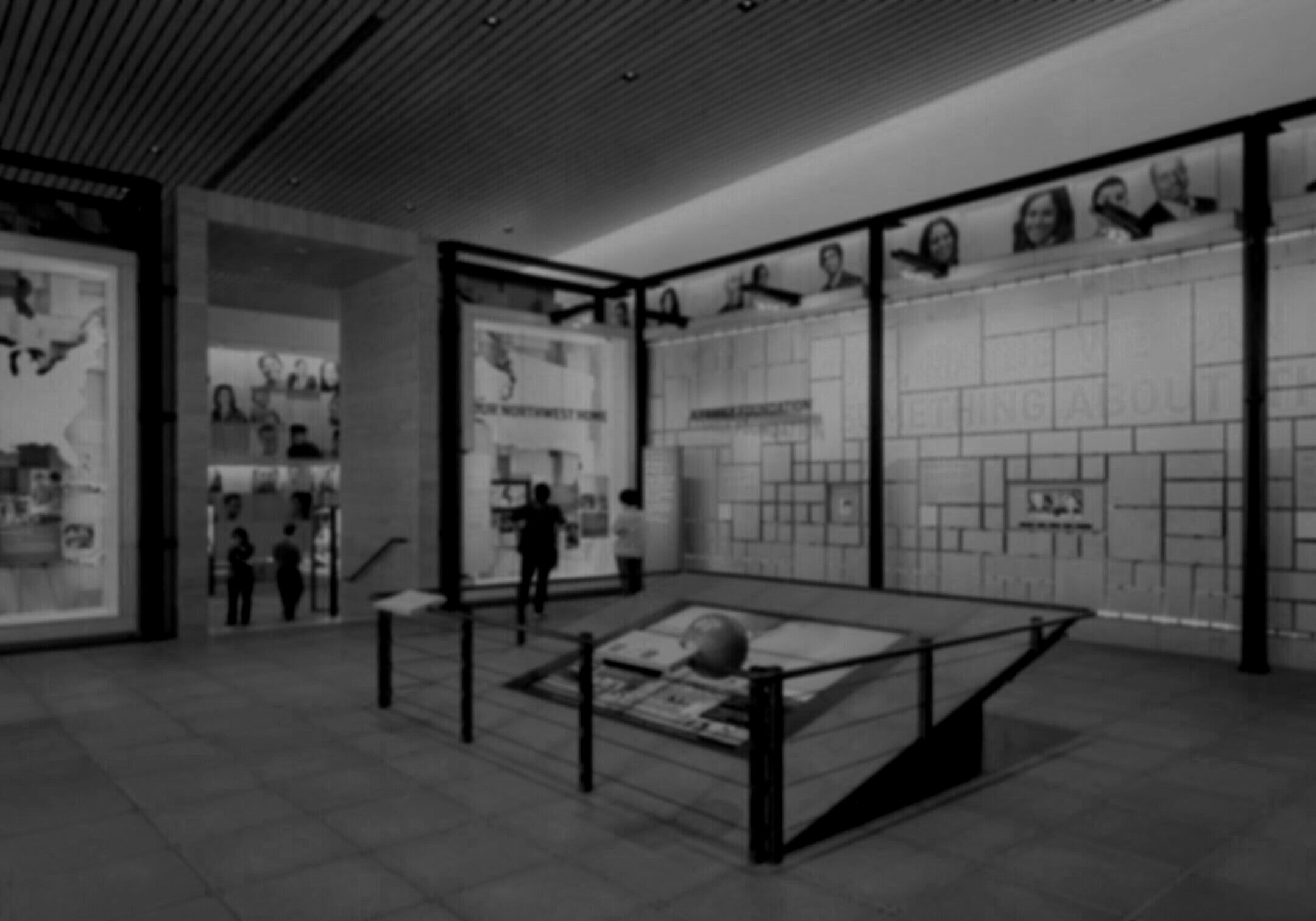
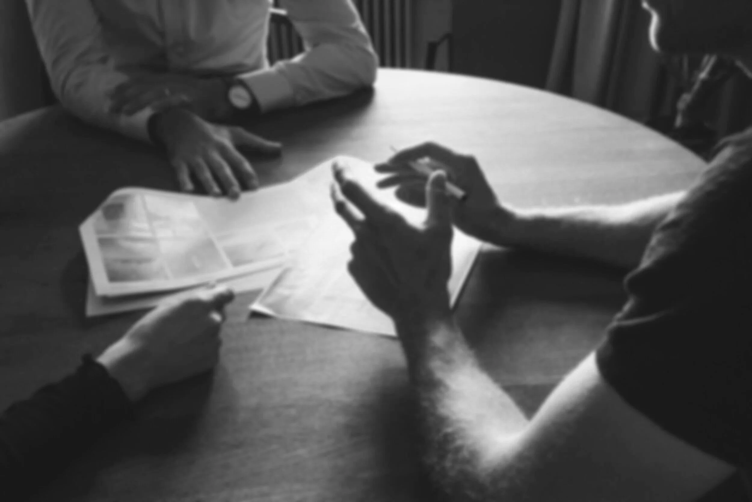
I now understood the needs of the Discovery Center and the Changemakers, but I didn’t know anything about the goals and motivations of museum visitors. In order to understand them, I read every guestbook entry I could get my hands on, and interviewed 10 visitors at the Discovery Center.

I came away from my research with three big insights.

INSIGHTS

1. Visitors feel personally connected by the work being done by Changemakers.

Many visitors used the guestbook to thank Changemakers for their work and share a personal anecdote.

“Traveling to Sarong, Irianjaia, Indonesia in 2000, we learned the people believed they were born with Malaria. Everyone suffered with it from time to time.

And so did Sandy, 5 months after our return to the US, he suffered a Malaria attack. Local healthcare in Chicago was uninformed and several more attacks were suffered before it was successfully treated. We understand full well the agony and danger of Malaria.

Thank you for your work. Looking forward to the vaccine.”

Pam + Sandy, Encinitas, CA, USA

Others used the guestbook to say that they planned to take action in their community after being inspired by Changemakers.

“What an inspiring place. We so appreciated being made aware of the inventiveness + compassion of so many humans around the world. We'll be looking for ways to get involved.”

Ross + Val, Encinitas, CA, USA

2. Visitors want an opportunity to tell Changemakers how they feel.

I spoke with 10 visitors at the museum and asked them a series of questions to help me understand their goals and motivations.

I asked each visitor if they were interested in writing to Changemakers. With 1 being Not Interested and 5 being Very Interested, the average response was 3.75 out of 5.

Interest in communicating with changemakers. Scale of 1-5, with 1 being Not Interested and 5 being Very Interested.

3. Visitors who are interested in writing to Changemakers want follow-up communications from the Discovery Center.

I asked the same visitors about their level of interest in receiving follow-up communications from the Discovery Center.

We discovered a strong correlation between visitors who were interested in writing to Changemakers and visitors who were interested in follow up communications from the Discovery Center.


From these insights, I created a persona which I called the 'Volunteer Visitor.'

This visitor is either employed or volunteering somewhere doing work related to the mission of the Gates Foundation.


GOALS

Express empathy and gratitude to Changemakers

Feel resolution and catharsis after an emotional experience

Feel seen and heard in their expression

Feel that they can make a difference

Take action after leaving the Discovery Center

Support the efforts of the Gates Foundation after leaving

PROBLEMS

No way to communicate with Changemakers

No follow up from the Discovery Center after leaving a comment

BEHAVIORS

Employed or volunteering somewhere doing work related to the mission of the Gates Foundation

Engage deeply with exhibitions and Discovery Center content

Comments often contain emotional stories or personal anecdotes

May address their comments to Bill and Melinda specifically


image.jpg
 

The Opportunity

How might we provide a platform for Discovery Center visitors to communicate directly with Changemakers?

I drafted the opportunity statement above. I felt that designing a way for visitors to write directly to Changemakers would give the guestbook experience a clear, definable purpose for each user group. Volunteer Visitors would be given an outlet to share their feelings with Changemakers. Changemakers would receive new messages daily from visitors, and the Discovery Center would no longer be the middleman between the two groups. A simple prompt at the end could easily turn visitor messages into newsletter sign ups. There’d be a little something for everyone.


image.jpg
 

Our Solution

We looked back to an earlier brainstorming session for inspiration.

Early in the process, I’d come up with the idea that visitors could send postcards to Changemakers. Postcards contain short, handwritten messages. Receiving a postcard is meaningful and memorable. It seemed like a perfect fit.

We found that physical postcards were interesting in theory, but the scope was too big. We wanted to keep the core of the idea—personal messages with a handwritten component—but we needed to evolve the solution.


We decided to design a digital kiosk where visitors can write messages to Changemakers.

Visitors who approach the kiosk are prompted to write to one of six pre-selected Changemakers. They type their message, add a digital signature with their finger to personalize it, and send it off. Visitor messages are sent directly Changemakers, or to the organizations they work for. At the end of the interaction, visitors are encouraged to sign up for the Gates Foundation Newsletter.

Several ideas for features in the kiosk interface.


image.jpg
 

Prototyping

We developed a user flow and wireframes as a team.

A user flow came together quickly since the kiosk would only allow visitors to complete one task. We then worked on wireframes together in a shared Figma file. This allowed for rapid iteration and the ability to see each other’s work immediately.


Quick and dirty, but ready to test.

Once we had a low fidelity mock up we were happy with, we developed a mid-fidelity wireframe as a group. The first iteration of the prototype used two screens: one close to the user for a keyboard and a signature pad, and one positioned vertically in front of the visitor. Once it was complete, we wanted to test it.


image.jpg
 

Usability Testing

I conducted the first round of user testing using a paper prototype.

I facilitated user tests of our wireframes with 6 visitors. We decided to use a paper prototype during testing since we were so early in the process. Using a paper prototype allowed us to find user’s biggest pain points without getting bogged down in the details of the interface.

IMG_5251.jpg

QUESTION

How will visitors select a recipient?

Our biggest question was about the Changemaker selection screen. How would visitors make their selection? Would they be interested in writing to a specific Changemaker, or would they make their selection based on the cause they felt most connected to?

ANSWER

Visitors select causes, not people.

We observed visitors selecting Changemakers based on the cause they felt connected to rather than because of any personal details about the Changemaker. This affected the way we displayed Changmaker names on the selection screen going forward.


BIGGEST PAIN POINT

Optimize for one screen.

The first iteration of our design used two screens. The upper screen contained the interface, and the lower screen had a digital keyboard and signature pad. We observed that using two screens was confusing for visitors. We knew we needed to eliminate a screen.


image.jpg
 

Second Iteration

In response to user feedback, I kept the interface to only one screen.

The result was a simple, straightforward design. I was able to take what was a 7 step process and cut it down to just 4 steps. The 4 step process became the backbone of the final design.

BEFORE

AFTER


Simplifying interactions.

One of the ways I simplified the design was by combining two steps of the flow: the signature and the preview. Moving the signature area to the bottom of the message gives users the feeling of signing a letter rather than signing a signature pad.

BEFORE

AFTER


image.jpg
 

Final Design

Putting on the finishing touches.

We tested the prototype I developed and found that visitors moved through it with greater ease than our original prototype. We also learned that we could remove the titles on the Write and Sign steps. A visual designer on the team chose a new color scheme and finalized the design. Below are the screens we presented to a representative from the Discovery Center.


image.jpg
 

Reflections

This project helped me discover parts of the UX process I didn’t realize I was passionate about.

This project gave me an opportunity to unpack a high-level problem, connect the dots, and get the whole team on board. Identifying the intersecting needs of three different user groups seemed complex at first, but once I uncovered the relationship between them, it felt almost like the solution presented itself. It became easy to make decisions as a group once I got the team on board.

If I could spend more time on this project, I would use it to research the Discovery Center and the Changemakers.

Our solution works given what we know about them, but I didn’t have the opportunity to spend time with either group the way I did with the visitors. Even just one conversation with one Changemaker could make this design stronger.


image.jpg

More Work

INTERACTION DESIGN | INDIVIDUAL PROJECT

Stompbox Retail Site

For those about to rock, purchasing an effects pedal just got easier.


 USER CENTERED APPROACH

Grindline Skateparks Brand Refresh

A company of renegade skateboarders needed to show they’d grown up. A brand refresh was just the trick.


Get in touch.

email me at stevesachs.ux@gmail.com