Steve Sachs

Stompbox Retail Site

For those about to rock, purchasing an effects pedal just got easier.


SKILLS USED

User Research, Information Architecture, Interaction Design, Wireframing, Prototyping, Usability Testing

MY ROLE

I developed this design while I was a student at SVC in Seattle. I was the sole designer on this project.


What is an Effects Pedal?

Guitar players plug their guitars into little electronic boxes called effects pedals to change the sound of the instrument.

Effects pedals are often referred to as stompboxes because guitarists control them with their feet, turning them on and off by stomping on them.

This short video (1:44) shows a guitarist using effects pedals and talking about how they work.


The Client

Stompbox sells boutique guitar effects pedals that turn their customers into guitar heroes.

Stompbox is a fictional company I created for this project. Stompbox focuses on quality over quantity, so they don’t have a large product line. Their products are designed with intermediate and expert guitar players in mind, but can be used by guitarists of all skill levels.


The Opportunity

Stompbox wanted to sell their product directly to customers.

The company has always sold their product through big box music stores, but once they realized how many purchases were being made online, they saw an opportunity to sell directly to customers.

They also wanted the site to inform and educate their customers.

Stompbox understood that customers can only make informed decisions about their purchases when they understand how the product works and what it sounds like.


The Users

Users of the Stompbox site fell into two distinct groups.

HOBBYIST

  • At least 3 years of guitar playing experience

  • Beginner to intermediate guitarist

  • Working knowledge of effects pedals

  • Has owned 10 pedals or fewer

PEDAL GEEK

  • At least 5 years of guitar playing experience

  • Intermediate to expert guitarist

  • Deep knowledge of effects pedals

  • Has owned 10 pedals or more


Information Architecture

Naming conventions for effects pedals aren’t standardized.

Without standardized terminology, users can’t easily navigate to the products they want to buy. This was a major design challenge that needed to be solved.

A guitarist discusses the grey area between two categories of effects. (2:16)


To understand how users categorize different pedals, I asked 5 users to complete a card sort.

I contacted 3 Pedal Geeks and 2 Hobbyists and had them participate in a closed card sort.


FINDINGS

Consensus between users about two of the categories, Parts & Accessories and Gain, were high. There was less agreement about which pedals belonged in the Modulation, Dynamics, and Time-Based categories.

RECOMMENDATIONS

Users shouldn’t be punished for their lack of technical knowledge (or for years of naming inconsistencies within the effects pedal industry). To match the mental maps of different users, certain pedals would need to be listed in multiple categories.

CARD SORT RESULTS.png


Understanding User Needs

How do users become informed and educated about the effects pedals they intend to purchase?

The most important thing to know about a pedal when making or researching a purchase is how it sounds. I wanted to know how users preferred to hear the sound of a pedal they were interested in purchasing. After they completed the card sort, I asked the five aforementioned users the following question:

“When you want to know how a pedal sounds, are you more likely to seek out a video demo or listen to audio samples?”


FINDINGS

4 out of 5 users responded that they rely on video when researching a pedal.

RECOMMENDATIONS

These decisive results indicated that the design would need to prominently feature video.

QUESTION RESULTS.png


Paper Prototype

Due to the tight time constraints on this project, I began with a paper prototype.

I was able to iterate rapidly on my designs and surface major problems early in the process by immediately testing the prototype.


I began by creating a site map.


When sketching the prototype, I took a mobile first approach. 

I knew I’d need to develop a design for desktop eventually, but I took a mobile first approach in order to focus on usability and reduce the amount of unnecessary elements on each page.


Usability Test - Paper Prototype

I tested the paper prototype with three users.

I recruited two Pedal Geeks and one Hobbyist for usability testing. I asked them to think aloud as they used the prototype. Then I had them perform several task based tests.

IMG_3832.jpg

Here were my top level findings.


INSIGHT

Users felt the site was too sales-y.

Rather than introducing the site, the design lead with a banner ad and a promoted product, pushing users to buy, buy, buy.

RECOMMENDATION

The design needed to welcome users to the site before asking them to make any purchasing decisions.


INSIGHT

Users had difficulty navigating away from the home page.

I thought a home page free of navigation would allow the design to feature more products, so I tucked all navigation into a hamburger menu. Each user found the hamburger menu, but expected navigation on the home screen.

RECOMMENDATION

Navigation on the home screen would increase usability by allowing users to view all their options.


Mobile Wireframes

I continued with a mobile first approach when designing digital wireframes.


I incorporated the findings and recommendations from the usability tests into the design.


The new design introduced the site to users.

The wireframe features space for a hero image at the top of the homepage in order to orient users and welcome them to the site.


And it featured primary navigation on the home screen.

Below the hero image, users are immediately shown navigation. They can navigate to 4 different category pages directly from the home screen.


I also designed four features to inform and educate users about the product.


ONE

Category Definitions

By clearly defining each category, the Category Page informs and educates users and reduces confusion around naming conventions.

TWO

Video Demo

In response to the survey results from early in the process, the design prominently featured a video demo just below all the product details.

THREE

Interactive Knob Diagram

This interactive diagram helps users learn the function of each knob. Users tap the knob and a description appears below.

FOUR

Suggested Settings

A cheat sheet for the best sounds. Below the diagram is an audio sample. Users can swipe for more suggested settings.


Usability Testing - Clickable Prototype


I conducted usability tests with 4 users.

I recruited 3 Pedal Geeks and 1 Hobbyist. I asked them to think aloud as they used the prototype. Then I had them perform several task based tests. I noted where the design presented usability issues.

Then I created an affinity map of user pain points.


Here were my top level findings.


FINDING ONE

The “Time-Based” category was unclear to users.

Consistent with my early finding that there was little consensus regarding naming conventions, 2 of 4 users found the label “Time-Based” unclear in the main navigation.


THE FIX

I changed the “Time-Based” category to “Reverb & Delay.”

By making the label less jargony and more specific, both Pedal Geeks and Hobbyists should have less difficulty finding the pedal they’re looking for.

REVERB & DELAY.png


FINDING TWO

Users were confused by the Interactive Knob Diagram.

The diagram, labeled Dial In Your Tone shows a vector image of the pedal. It allows users to tap a knob to learn what it does. 3 out of 4 users expected to be able to twist the knobs and hear audio that corresponded with the movement.


THE FIX

I added clearer instructions to the knob diagram.

The knob diagram was originally labelled Dial In Your Tone, implying the ability to twist the knobs. I relabeled the diagram so that it read Tap a Knob.

A FEW THOUGHTS

It may be that the implied affordance of a knob will always be a twisting function, but clearer instructions might help users understand how to interact with the diagram. Replacing the vector with a photo of the pedal may be an even stronger solution. If I’d had more time, I would have tested various designs to validate my decisions.

KNOB UPDATED CIRCLE.png


Desktop Wireframes

The elements of the desktop wireframes were well defined because I took a mobile first approach.

By iterating and testing my mobile designs first, I’d done a lot of the hard work up front. Converting the design to desktop was straightforward.

The Product Page prominently features a video demo.


Final Presentation

I presented the final designs and submitted annotated versions of both mobile and desktop wireframes.

You can view the annotated wireframes here.


The final designs were well received by my instructor.

His comments are below.

Your submitted work for this course got stronger and stronger as the course progressed, culminating in a very successful and in many ways exemplary Course Project. That (and its presentation in our last class session) featured really strong, clear UX and IxD work—substantial, detailed, engaging, and well annotated. Very good use of mid-fi visual elements for your diagrams, which conveyed a lot of helpful info (such as your knobs component/controls). Nice incorporation of usability findings, too. The possibilities for future exploration that you mentioned during your presentation also seemed really promising, so keep those in sight, and consider moving this work further forward: you could have a case study on your hands. Stomp on!


Reflections

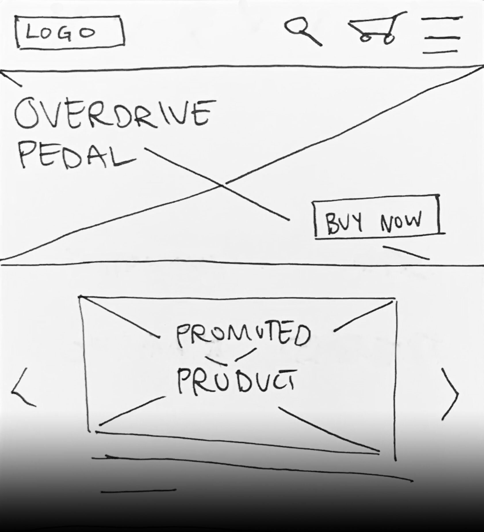
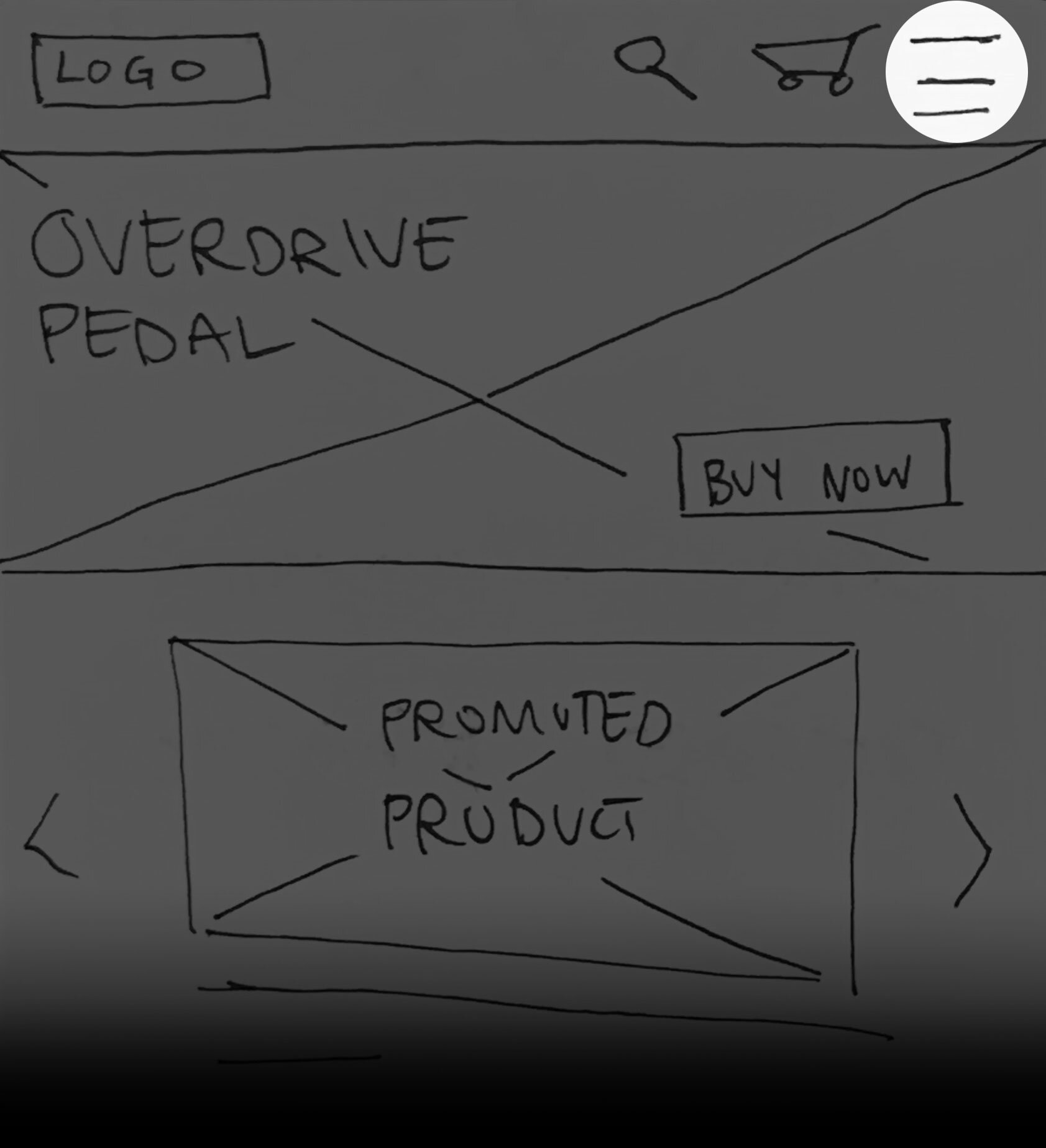
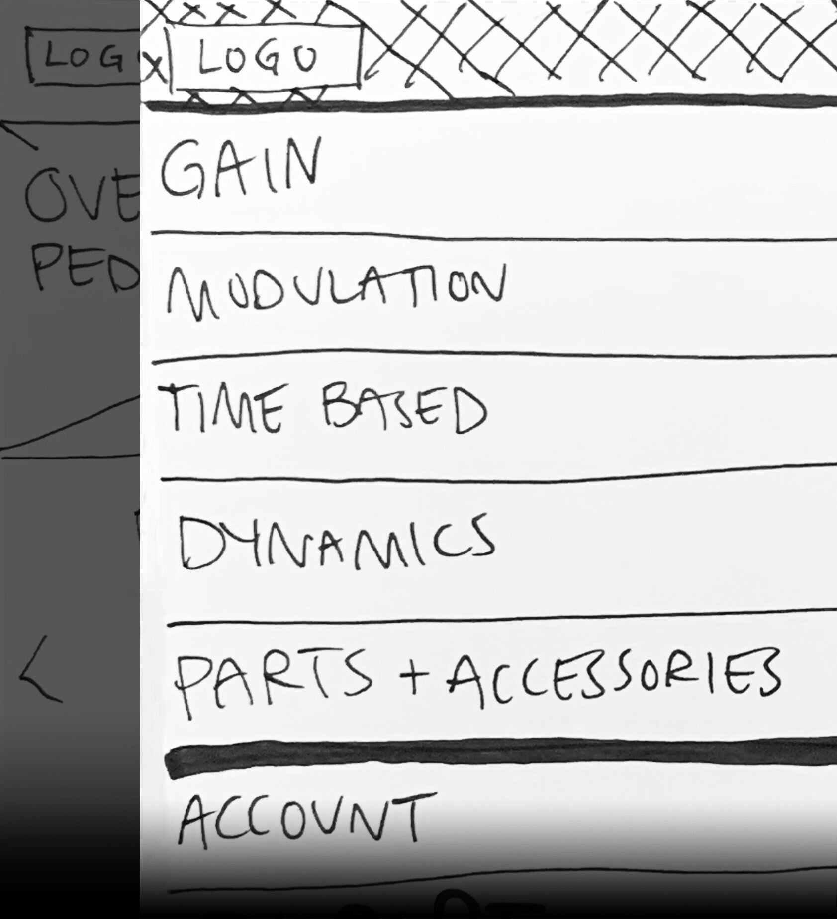
I learned the value of making a paper prototype before jumping into digital wireframes.

I saved a tremendous amount of time by starting with a paper prototype. Not only could I iterate quickly, but I was able to test my designs early in the process and surface a few major design problems.

The Interactive Knob Diagram taught me an important lesson about affordances.

It may be that the implied affordance of a knob will always be a twisting function, but clearer instructions might help users understand how to interact with the diagram. Replacing the vector with a photo of the pedal may be an even stronger solution.

If I’d had more time, my next step would have been validating the changes I made after the usability test with the clickable prototype.


More Work

END TO END PROCESS | TEAM PROJECT

Bill & Melinda Gates Foundation Discovery Center Museum Guestbook

The museum asked for a guestbook. We designed an emotional experience that connects real people.


USER CENTERED APPROACH

Grindline Skateparks Brand Refresh

A company of renegade skateboarders needed to show they’d grown up. A brand refresh was just the trick.


Get in touch.

email me at stevesachs.ux@gmail.com